Reviewed by annieb123 on
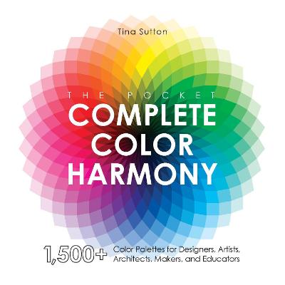
The Pocket Complete Color Harmony is a color reference with over 1500 suggested palettes. This is a pocket sized abbreviated companion to The Complete Color Harmony by the same author. Released 13th Oct 2020 by Quarto on their Rockport imprint, it's 192 pages and available in compact paperback and ebook formats.
This is a very concise and accessible introduction to color theory and use. The introduction includes info about the color wheel and primary, secondary, and tertiary colors, but it provides additional information about actually choosing and *using* color (which is where most of us stumble). The author also includes info on the artistic process, and shading, tint, brightness and other technical aspects but additionally provides a multitude of palettes already made for people looking for some direct help (stitchers, painters, decorators, makers, etc).
The palettes are arranged roughly thematically: purity, richness, boldness, and many (many) more. Palettes are provided with 2-3 color swatches each, numbered by hue, tint, and shade. There's a key to the numbering and labeling of the colors at the beginning of the book along with suggestions for how to use them. I'm not 100% sure exactly how useful the system is (it's not, for example, the pantone codes) but for general use it's quick, usable, and layman accessible.
This would be a nice selection for maker's group, artist's studio, fibre-artists, guild groups, library acquisitions, and similar. Four stars. (For readers - it goes without saying that the electronic version must be accessed on a device which has a color screen).
Disclosure: I received an ARC at no cost from the author/publisher for review purposes.
Reading updates
- Started reading
- 8 November, 2020: Finished reading
- 8 November, 2020: Reviewed
