Reviewed by Eve1972 on
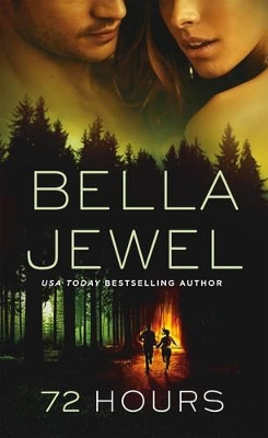
This is an almost perfect cover. It's a good representation of the story. It's eye-catching and original. The composition is fairly good, but AGAIN we have the author's name two sizes larger and in the prominent place that the title should be. If I've said it once I have said it a million times. The largest text on a book cover should be the TITLE. My graphic design professor's head would have exploded if he saw something like that back when I was in school. *lol*
This book gets ALL the christ on a cracker stars. It was fabulously written. Amazingly paced. Had twists and turns. Had a little bit of romance. Had two strong and likable main characters. Had a twisted as fuck baddie. I COULD NOT put this thing down! In fact, I read it from cover to cover all in one go. AND the best news...there is going to be another book with a whole different twisted fuck coming out sometime this year. You can sign me up RIGHT NOW. Two HUGE thumbs, fingers, toes, legs...up from yours truly.
Reading updates
- Started reading
- 22 March, 2017: Finished reading
- 22 March, 2017: Reviewed
