Reviewed by Quirky Cat on
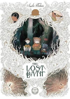
The Lost Path is Amelie Flechais’ four graphic novel; the others include The Little Red Wolf, The Mountain Man, and The Warrior Shepherds (which I haven’t read, but I believe is another children’s story). All four stories have actually been translated from French, but you couldn’t tell it when reading. For those curious, The Lost Path is called Chemin perdu in French (and the cover actually fits this title better, I believe).
The Lost Path is about a cursed forest, forest spirits, and the adventure of a lifetime for three young boys. The forest has a dark history, and while we don’t know of the origin, we do get to learn a bit about some of the more recent influences the forest has faced.
Three boys end up inadvertently wondering into the cursed woods while heading out on a scavenger hunt – something typically considered to be a safe activity for children. What follows upon their entrance to the woods can only be considered magical – though not all magic is of the good variety.
The story was interesting, but what really stood out to me was the artwork. It was so unique, and the choices made for storytelling purposes were inspired. I don’t think I’ve seen a graphic novel that changed from full colored images to ink images for the sake of telling a story; but I believe that’s what happened here. It seemed to me that whenever the forest was making a move the artwork suddenly changed to a darker tone, using mostly inks and cross hatching to add in density and lines. Meanwhile the happier moments are full of color and have a lighter, fluffier appearance. It was wonderfully done, and I would very much like to see more of this style.
For more reviews, check out Quirky Cat's Fat Stacks
Reading updates
- Started reading
- 15 March, 2018: Finished reading
- 15 March, 2018: Reviewed