Reviewed by Quirky Cat on
I should probably preface this by saying that I love typography. It’s my favorite graphic design focus, and I love reading about the history of fonts and typefaces. Naturally when I saw this book I knew there was no way I could continue without having read it, so here I am.
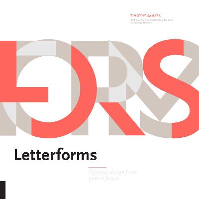
Letterforms is wonderfully comprehensive in the subject that it is covering. Everything from the history to how individual letters were invented, to their evolutions (accompanied by fun anecdotes), and finally even their reinventions.
That doesn’t sound like that much to squish into one book, but trust me when I say that it is. The history of type is actually quite long and sometimes overwhelming. This book gives a full and comprehensive look at it without throwing too much information at once. In short, it’s the perfect balance. Never one did I feel like I was reading a list of facts as opposed to an actual novel, and that exactly what I was hoping for.
Reading about the invention and evolution of the individual letters was fascinating. I knew the basics, but honestly I’ve never seen such an in-depth explanation like this one. I’m absolutely thrilled with it. I actually wish I had this book when I was working on my graphic design degree, but alas…
If you’re looking to learn about something new, or have already found yourself fascinated with letterforms, then this is absolutely the book for you. It’s charming and informative and very well written.
For more reviews, check out Quirky Cat's Fat Stacks
Reading updates
- Started reading
- 5 July, 2018: Finished reading
- 5 July, 2018: Reviewed
