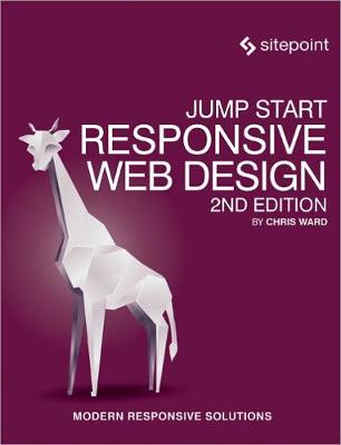
It used to be so simple. You made a website or application to work on a 15" monitor and, incompatibilities between browsers aside, you were done. Then along came mobile phones with web browsers and they ruined all our easy lives. Worse than that, people loved browsing the web on them! Fortunately, by using responsive web design techniques, you can use one set of HTML, CSS and JavaScript, and display appropriate elements in an appropriate way to suit each platform. In Jump Start Responsive Web Design, you'l learn responsive techniques to make your designs look magnificent on any device, future-proof them, and reduce development time and budget. RWD helps you deal with the very real problem of not knowing where and how your application will be used. Completely overhauled for its second edition, this book covers: What does responsive really mean? Semantic page structure Grid systems Responsive Images and media Media queries Responsive content
- ISBN10 099434709X
- ISBN13 9780994347091
- Publish Date 5 May 2017
- Publish Status Unknown
- Publish Country AU
- Imprint SitePoint Pty Ltd
- Format Paperback
- Pages 350
- Language English
