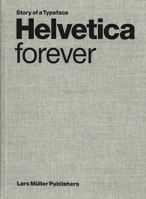
Designed in 1957, the Helvetica font is an icon of Swiss graphic design, which was a model of sober, functional communication throughout the world in the 1950s and 60s. The balanced and neutral appearance of Helvetica forgoes a high degree of expressivity a quality for which it is both criticized and admired. This polarization has helped to gain it unparalleled notoriety. Helvetica is far and away the most widely used of all typefaces; according to a survey by the Berliner Fontshop-Archiv, it tops the list of the hundred best fonts of all time. This publication retraces Helvetica's fifty-year history, compares it to the well-known sans serif fonts of the twentieth century, and examines the phenomenon of its unparalleled spread. Numerous illustrations show a multitude of ways the font has been used in five decades from a wide variety of fields from signal design to party flyers. AUTHOR: Lars Muller was born in Oslo 1955 and has been living in Switzerland since 1963. After doing his apprenticship as a graphic designer, and years of apprenticeship and travel in the USA and Holland, he opened a studio in Baden in 1982. In 1983, Lars Müller began publishing books on typography, design, art photography, and architecture. ILLUSTRATIONS 150 images
- ISBN13 9783037781210
- Publish Date 1 January 2009
- Publish Status Active
- Publish Country CH
- Imprint Lars Muller Publishers
- Format Hardcover
- Pages 130
- Language English
